ukoi.space
● Self-initiated vibe coding experiment
Product R&D / Claude AI
Soothing an Anxious Mind, One Prompt at a Time.
I built ukoi (Polish for “soothe”) because I was frustrated with coping techniques scattered across notes, saved posts, and half a dozen apps. The idea became simple: choose how you feel, get techniques matched to that state. Claude became both collaborator and builder in the process.

Most wellness apps assume you know what you need. That breaks the moment anxiety hits.
● 01
Scope & Setup
Starting from a user story, not a spec
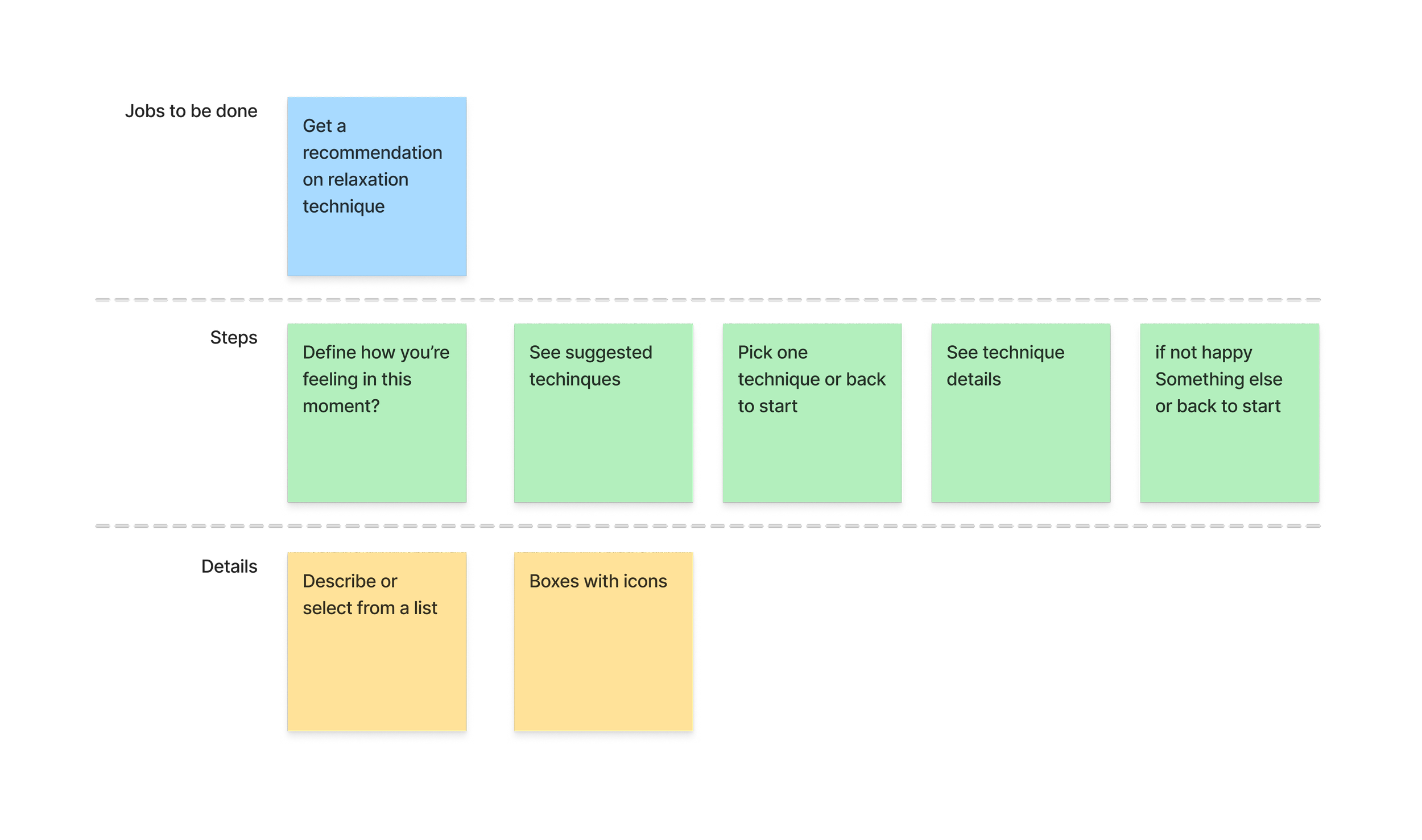
The project started from a problem, not a spec. We mapped a lightweight flow together: emotion in, four techniques out, detailed steps, reset. Claude proposed the stack — Next.js App Router, serverless API routes, Vercel deployment — and scaffolded the environment conversationally. The biggest product decision was restraint: no accounts, history, or tracking. Just support in the moment you need it.
● 02
Information Architecture & Content
Designing the core experience
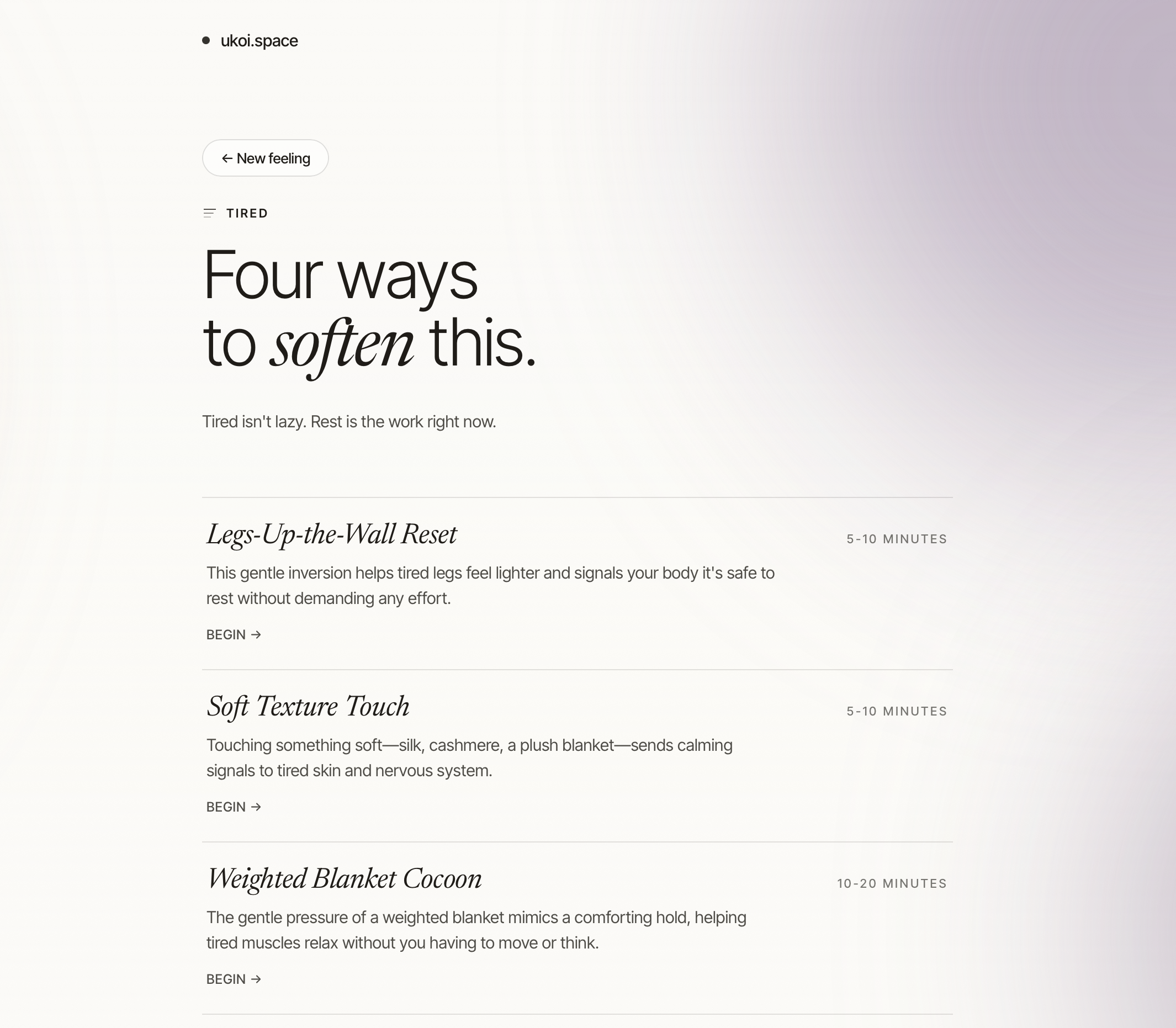
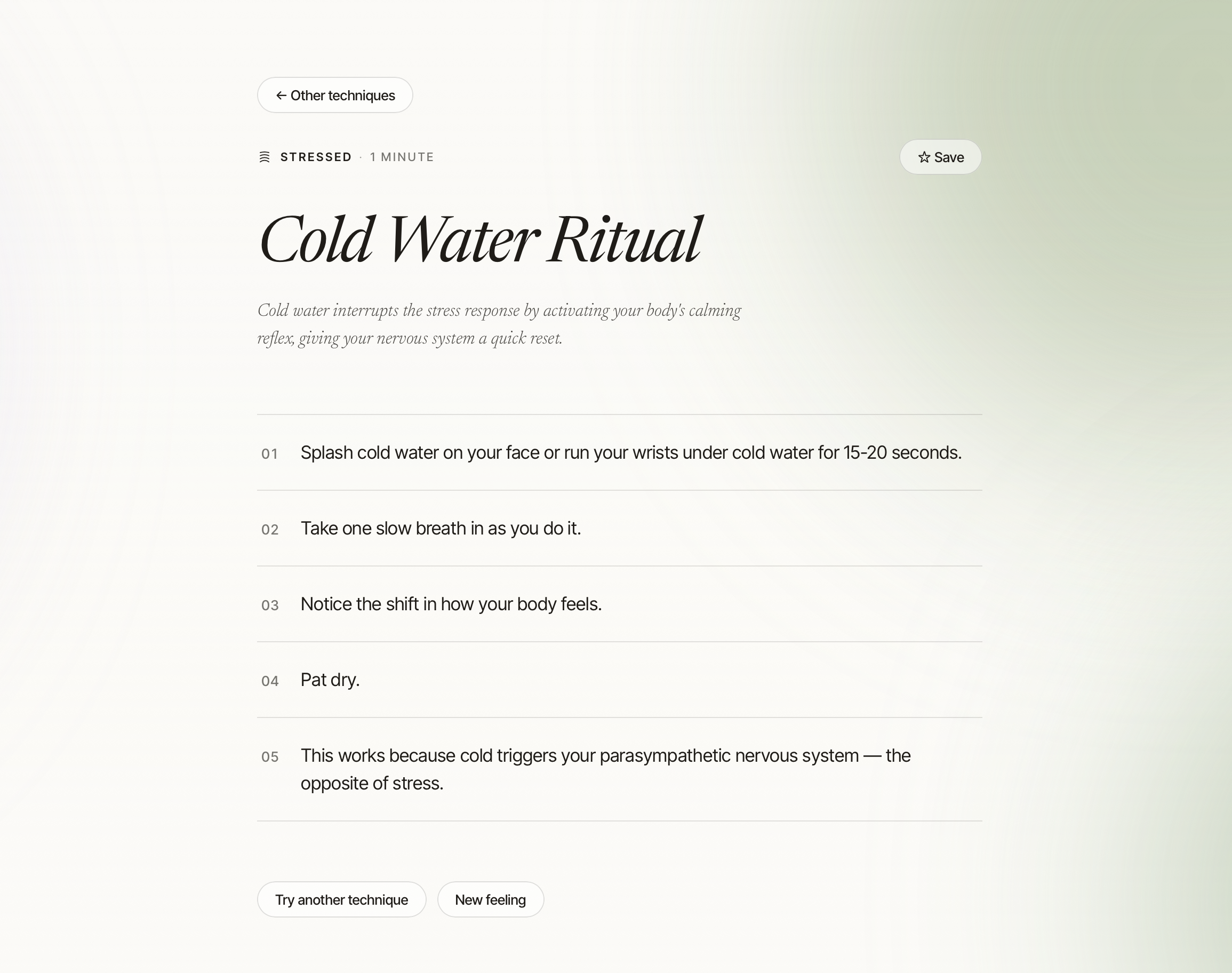
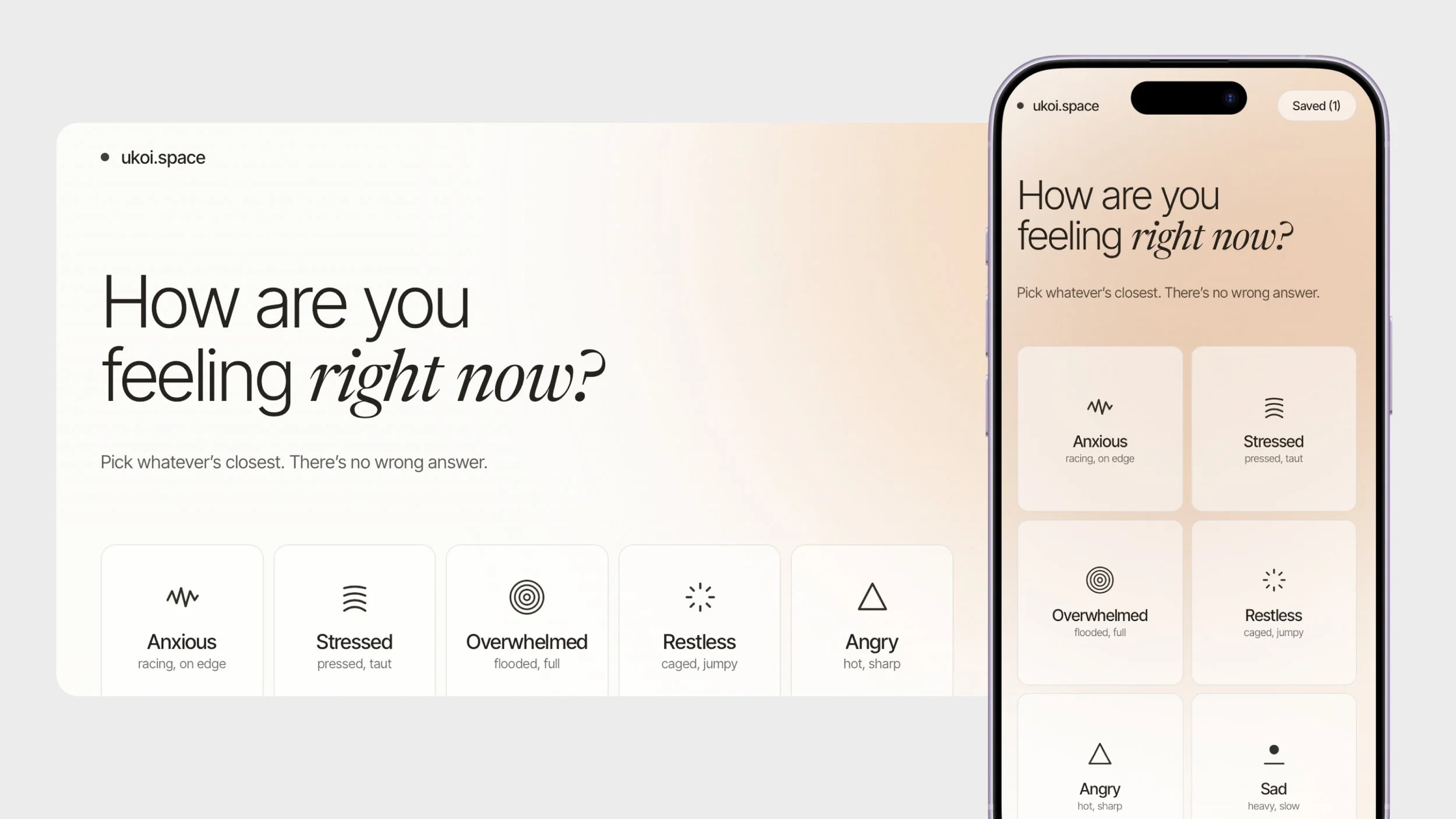
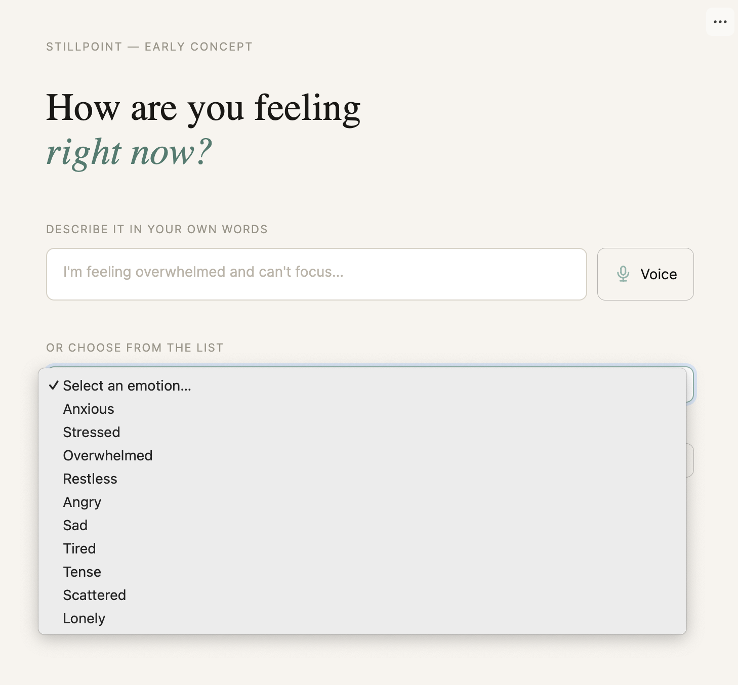
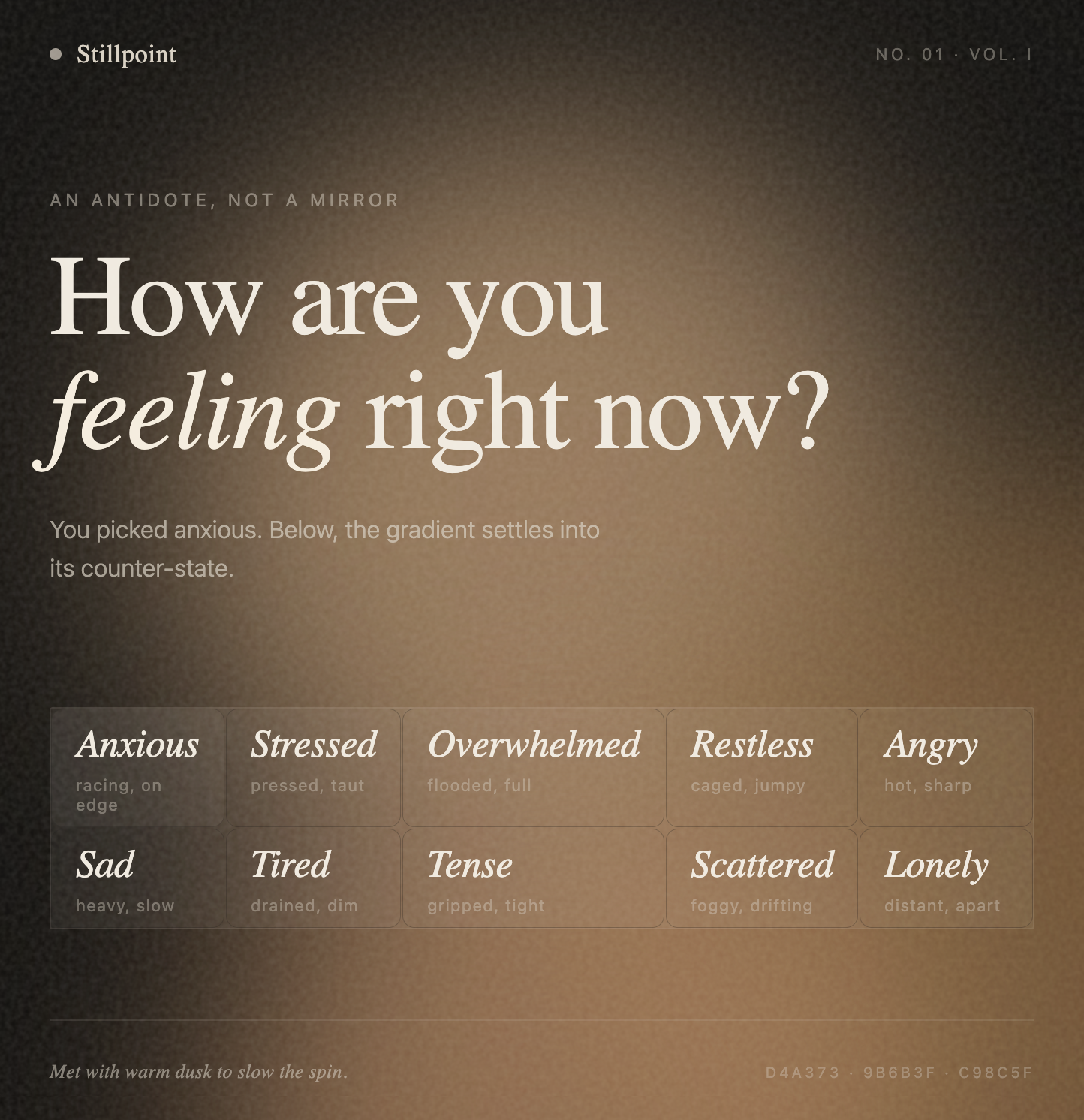
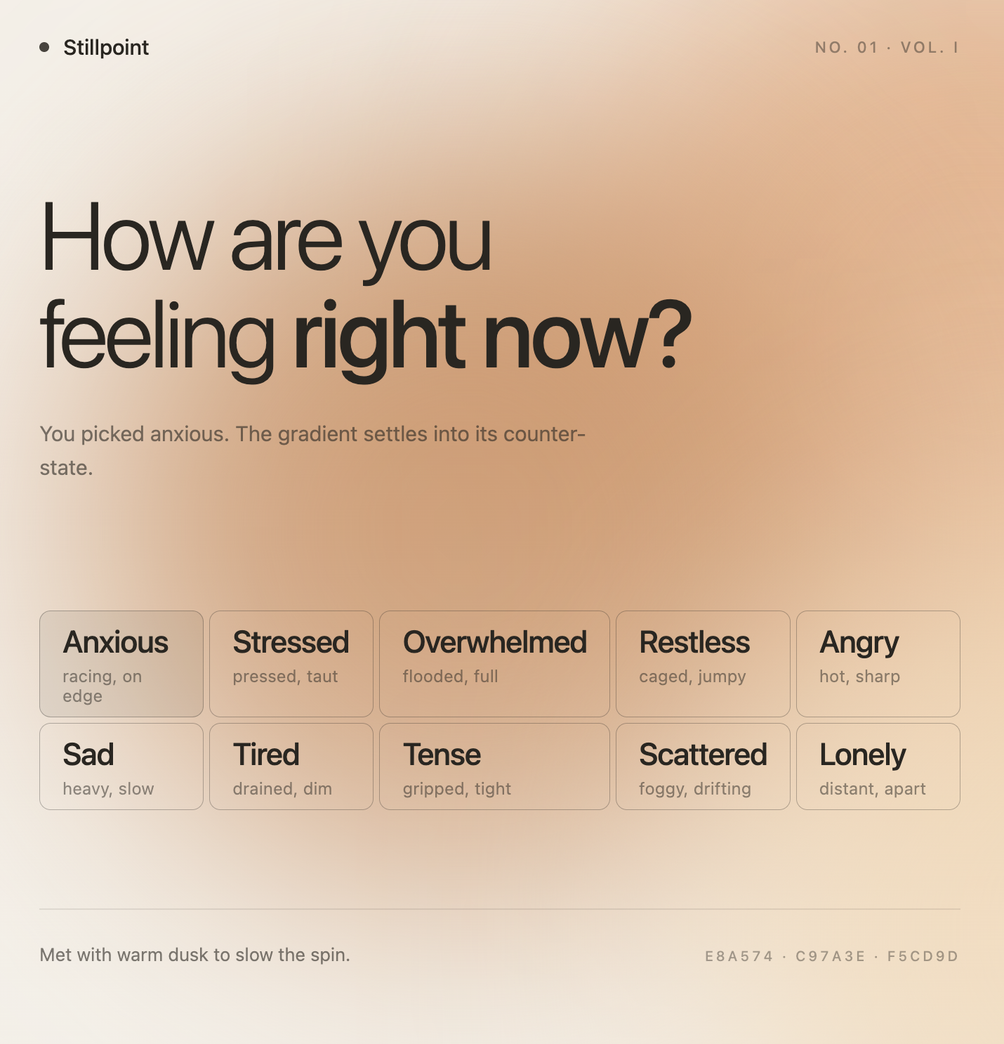
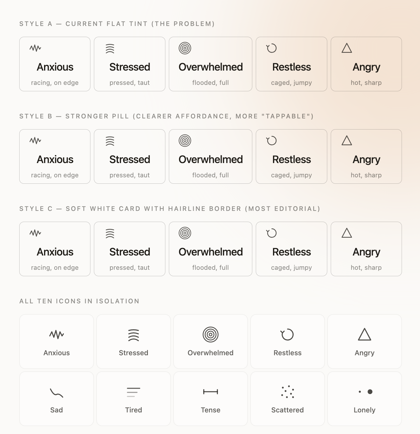
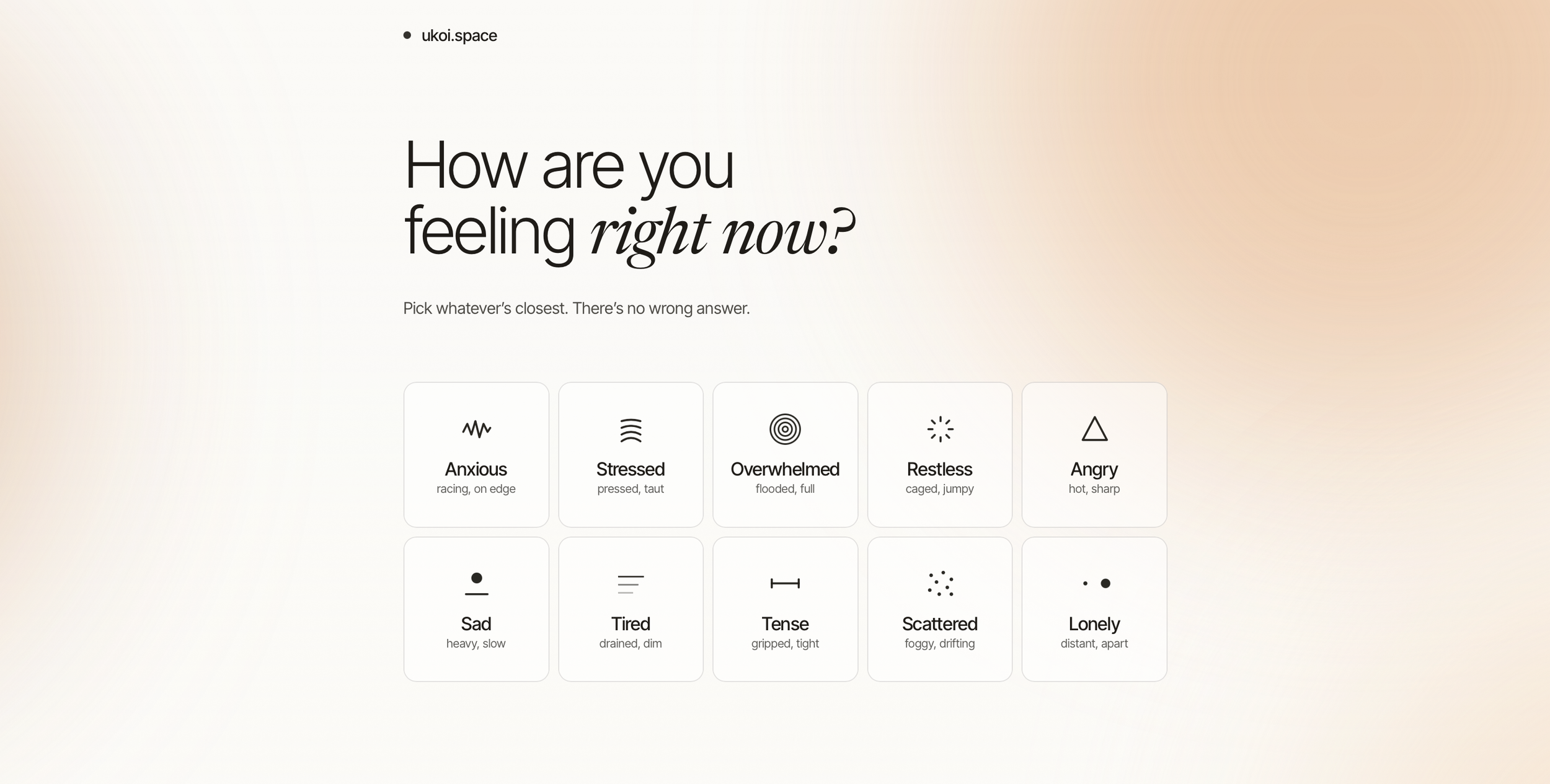
Before touching UI, we designed the structure. The content model stayed intentionally thin: technique name, short description, category, steps. The system prompt returned strict JSON so the frontend never had to interpret messy output. We narrowed the emotion picker to ten states: broad enough to feel useful, small enough to avoid overwhelm. Each emotion also got custom subhead copy to make the experience feel more human and specific.
● 03
Cost & Performance
Making an AI app economically defensible
Before going public, the cost model needed work. Claude helped design a three-layer optimization system: Anthropic prompt caching, Redis-based response caching on Vercel, and Upstash rate limiting. Instead of caching one static response per emotion, the app serves randomized variants so repeat interactions still feel fresh. The result: roughly 85–95% lower API costs under normal usage without sacrificing UX.
● 04
Art Direction & Feedback Loops
Iterating a visual language through conversation
The visual language evolved through rapid conversational feedback loops. The first direction was dark and editorial; the second shifted to a warmer, lighter aesthetic. One principle stayed constant: visuals should counter the emotion, not amplify it. Anxiety received soft dusk gradients, anger cooler compression tones. The iteration cycle was simple: render, critique, refine. No design tool involved — just conversation.
● 05
It’s Alive!
Shipping a side project that actually works
The final product, ukoi.space, is fast, minimal, and opinionated.
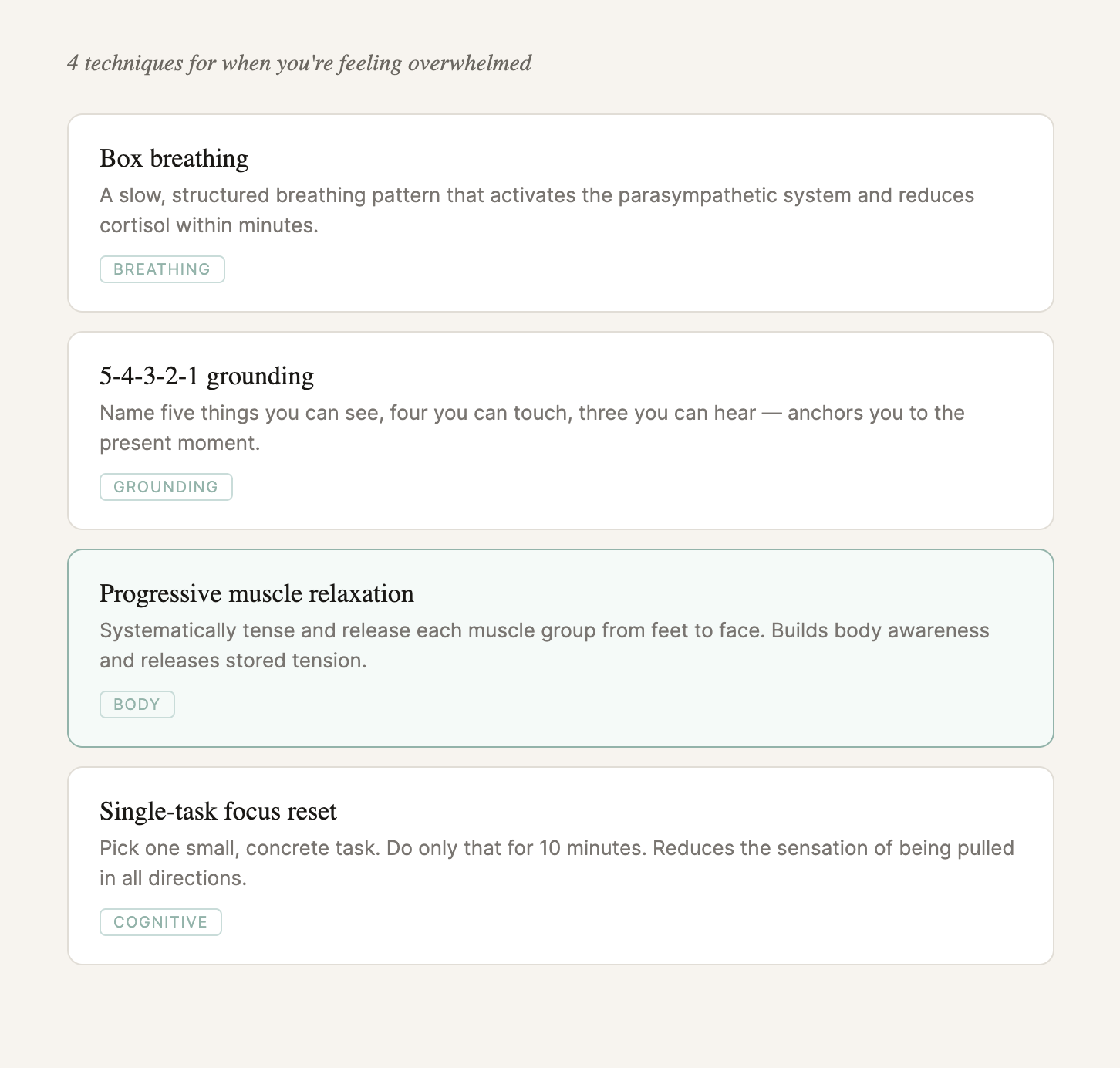
Users select from ten emotions, receive four tailored techniques spanning breathing, grounding, cognitive, and body-based approaches, and move through each step at their own pace. From first idea to LinkedIn launch, the entire product was built conversationally — less like handing off specs to a developer, more like thinking out loud with a collaborator that could also ship the code.