

Adobe Blog
● Adobe / Welikesmall
Lead Designer / Product UX/UI
3 months / 4-6 Team
Adobe XD / Figma
Personalized content streams bring the power back to the user in the new Adobe Blog.
Led UX/UI design for Adobe's global content platform, serving designers, developers, and marketers across 150+ product lines. Focused on personalization architecture, content discoverability, and a scalable design system.

PROBLEM
The platform lacked a cohesive structure, consistent design system, and personalization. This made content hard to find for users, and hard to control for the teams publishing it.
Analytics revealed significant drop-off at the content discovery stage, users were landing on the blog but struggling to find relevant material across topics. At the same time, the editorial team managing 150+ product and employee blogs had no unified way to present their content, resulting in a fragmented, inconsistent experience across the platform. These two failure points, one user-facing, one operational, defined the core design challenge.
● 01
Research & Discovery
Analytics, heuristic evaluation, and competitive analysis aligned around a single friction point: navigating by topic was broken.
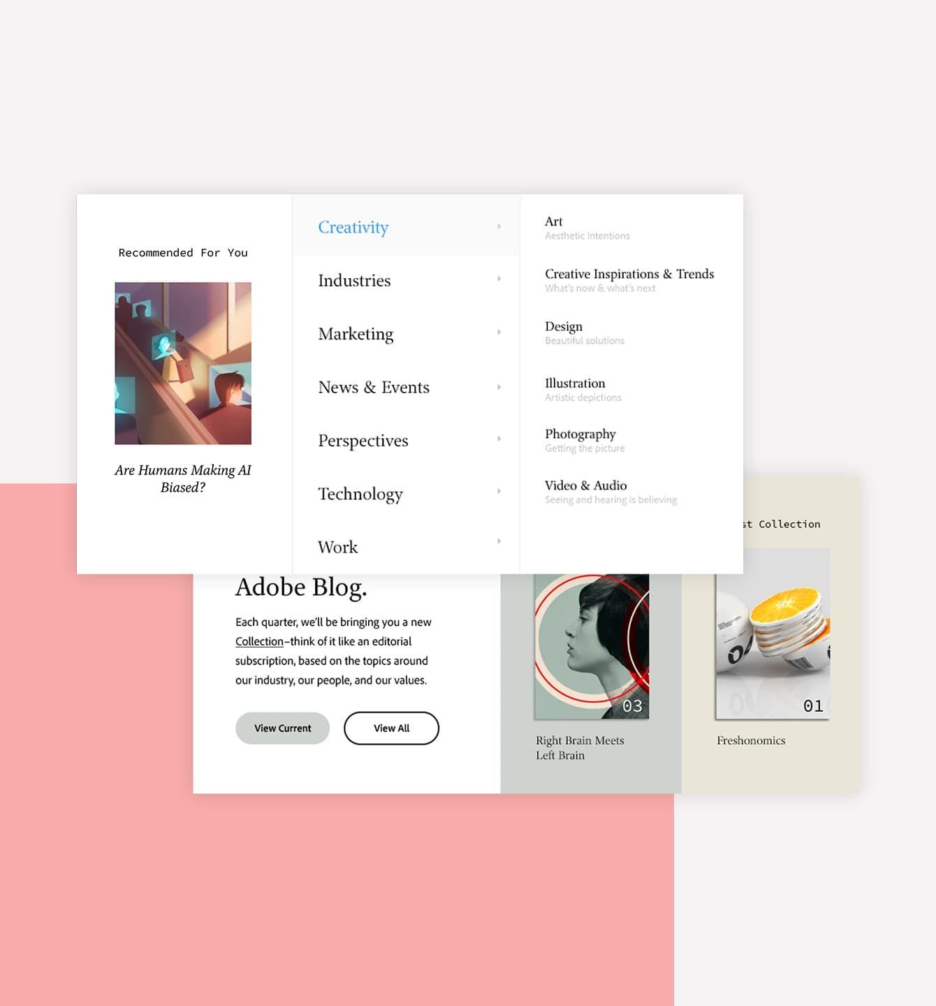
We combined an analytics review, heuristic evaluation, and competitive analysis to map where the experience was breaking down. The clearest signal came from both the data and the heuristic audit: there was no effective way for users to filter or navigate content by topic. Articles were organized inconsistently, tagging was unreliable, and the information architecture didn't reflect how users actually thought about Adobe's content areas.
Competitive analysis helped us benchmark against editorial platforms that had solved similar scale problems, informing our approach to taxonomy, content hierarchy, and personalization onboarding.
These findings focused our UX strategy on three priorities: a reliable and intuitive topic navigation system, a consistent content taxonomy, and a personalization layer that would let users self-select their interests.


● 02
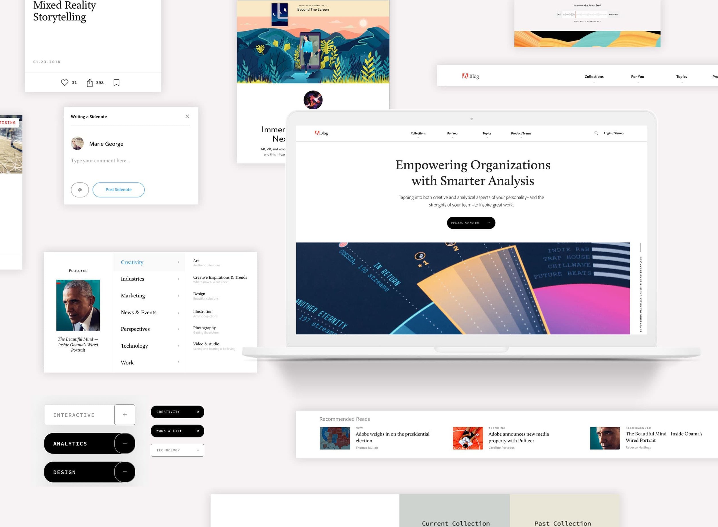
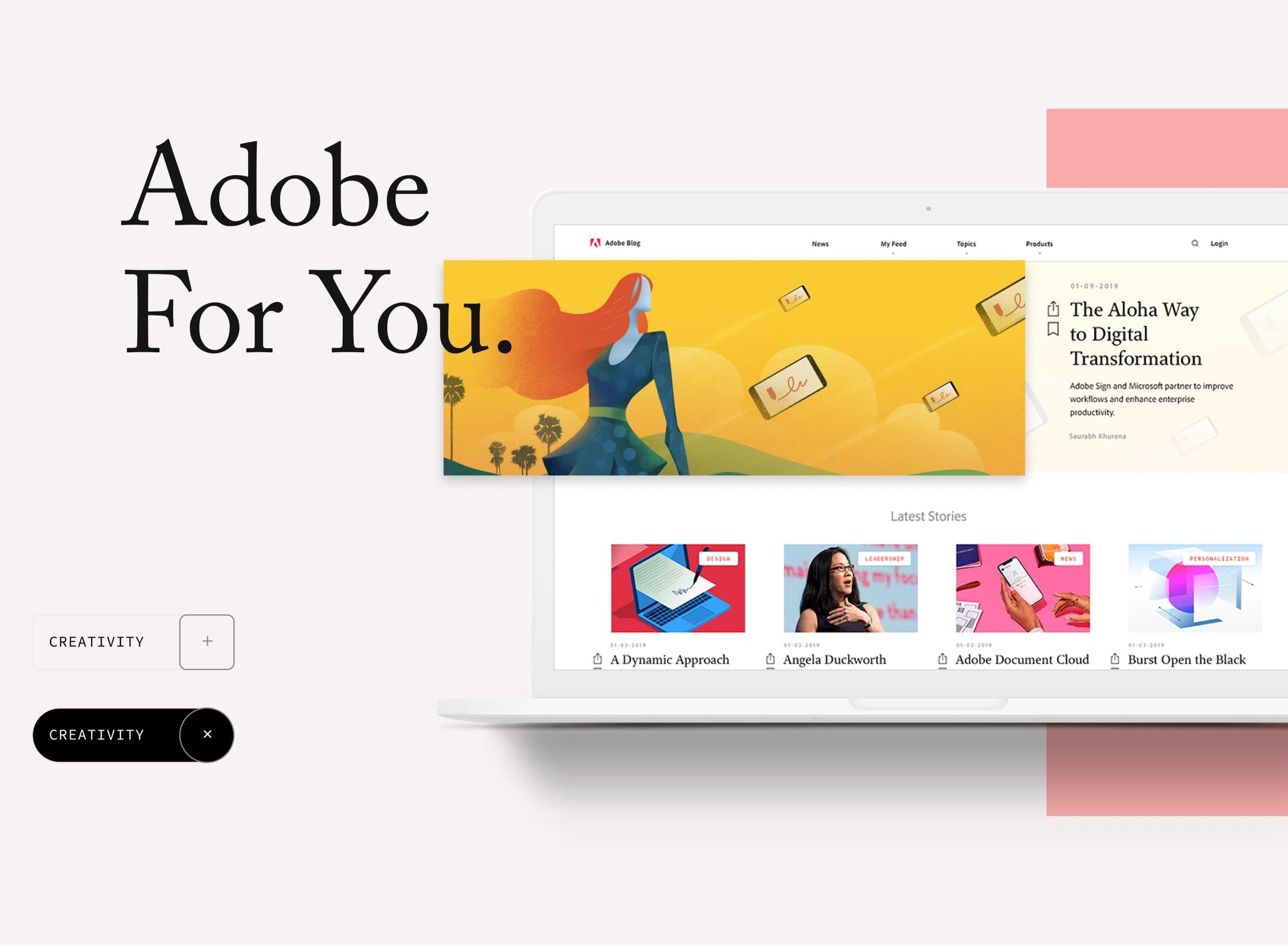
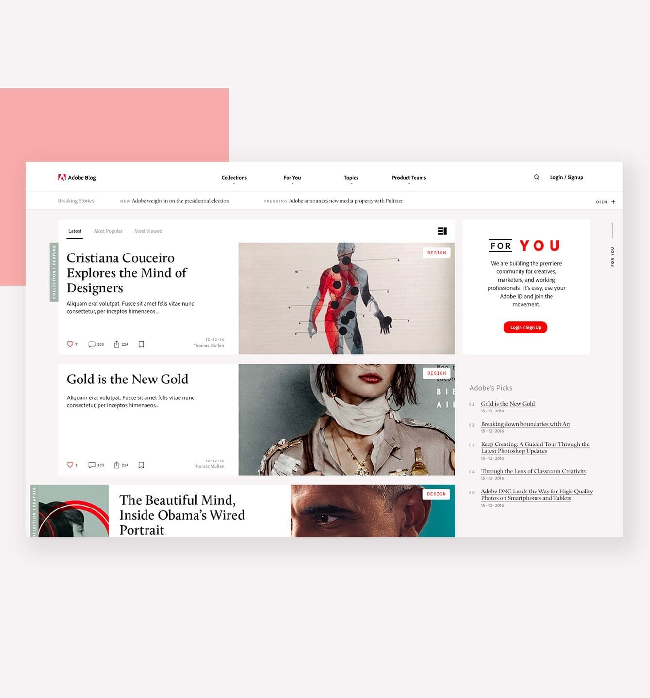
Adobe For You
A purpose-built design system, editorial-first, Adobe-aligned, built for scale.
Rather than adapting Adobe's system, built for product UI, we were directed by the Adobe team to design a system from the ground up, purpose-built for a content-heavy publishing platform. This meant establishing our own component library, typography scale, and color palette that felt native to Adobe's brand while serving the distinct needs of editorial design: readability, content density, and visual hierarchy across article types.
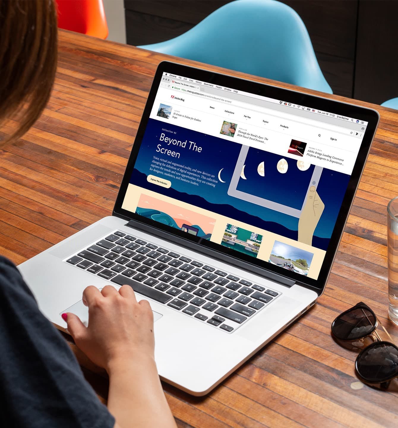
The result was a modular system that gave the content team, publishing around 50 articles per week, a consistent, scalable framework without constraining their editorial range. Every component was designed to work independently and in combination, simplifying future updates and onboarding for new content contributors.
● 03
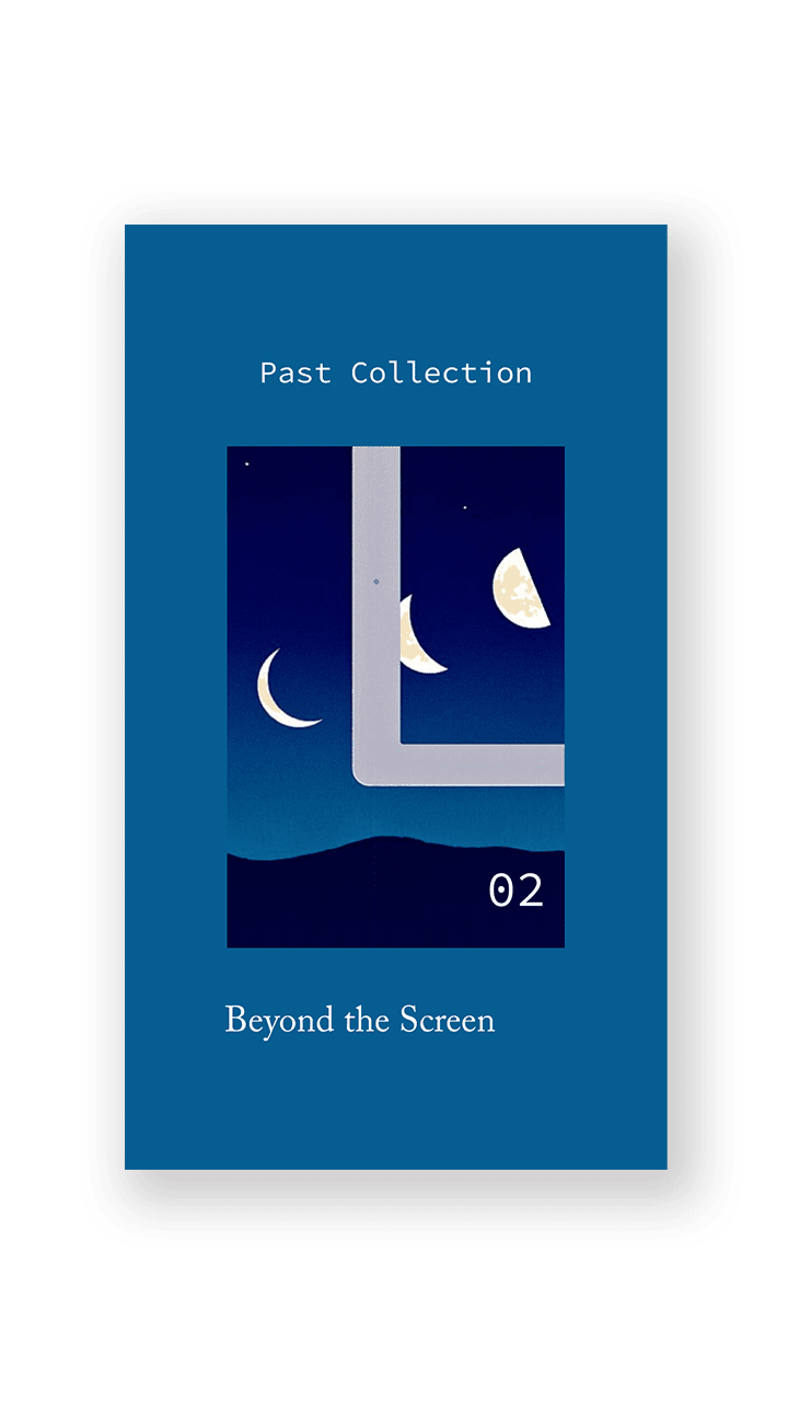
Curated Collection
Taxonomy rooted in real behavior, not assumptions.
The personalization model needed a content structure users would actually recognize and engage with. Rather than mapping topics to Adobe's internal product hierarchy, we used search and click analytics to identify how users were already navigating and expressing intent on the platform. This behavioral data shaped the topic taxonomy, ensuring the categories we offered in the "Adobe For You" experience reflected genuine user interest, not just editorial convenience.
The result was a subscription-style content layer that let users follow the topics most relevant to their work, cutting through the noise of 50+ weekly articles and surfacing what mattered to them.


● 04
Reading Experience
Users were abandoning long-form articles at high rates. We introduced a persistent progress indicator and structured sub-navigation to reduce cognitive load and support non-linear reading.

● 05
What I learned
Personalization is only as good as the structure underneath it.
The hardest challenge on this project wasn't visual. It was designing for two sets of needs at once: users who needed better content discovery, and an editorial team that needed consistency across a fragmented platform. Analytics told us what was broken, but not why. Without user interviews early in the process, some assumptions about intent had to be inferred rather than confirmed.
Looking back, I'd push for a lightweight round of interviews during discovery, and I'd validate the topic taxonomy directly with users before building personalization on top of it. Behavioral data was the right starting point, but it can only tell you so much about what people actually need.
The insight I've carried forward: personalization features live or die by the quality of the structure beneath them. Getting taxonomy right isn't a content problem. It's a design problem, and it deserves the same rigor as any interface decision.